This is the digipak for Pink Floyd's 'The endless river'. The digipak features a man on a gondola, sailing on a river of clouds into nothing. I think this is a very original design and an aesthetically pleasing design as well. The front cover relates strongly to the title of the album as well which is also a unique sign. The colours a bright, fluent and are used strongly to represent the link between the title of the album and the image.

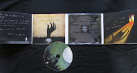
This is the Digipak for The Blackout and then album is called 'The best in town'. I really like this album because of the cartoon style used. It's very Gothic and dark but the use of colour really emphases the light. It's a really original design and would like to make my own Digipak in response to this album.


This is a Digipak for the Red Hot Chili Peppers and it's called 'Stadium Arcadium'. Throughout this Digipak there is a strong theme of space and planets. On the front of the Digipak there is a galaxy and on the back there is a picture of the band. The Red Hot Chili Peppers have chosen to have a picture of themselves on the back where as The Blackout have not, nor have Pink Floyd. I think this is because they like to advertise their band image. The track list is very small and unnoticeable, allowing there to be more focus on the imagery used. Throughout this Digipak there is a colour theme of blues, reds and yellows. On the back there a pictures of fires and buildings. On the far right there is also a leaflet on the band, the Blackout did not use an leaflet on their Digipak, possibly because they don't like to use band imagery on their albums.
No comments:
Post a Comment